
Pantone’s 2023 Color of the Year
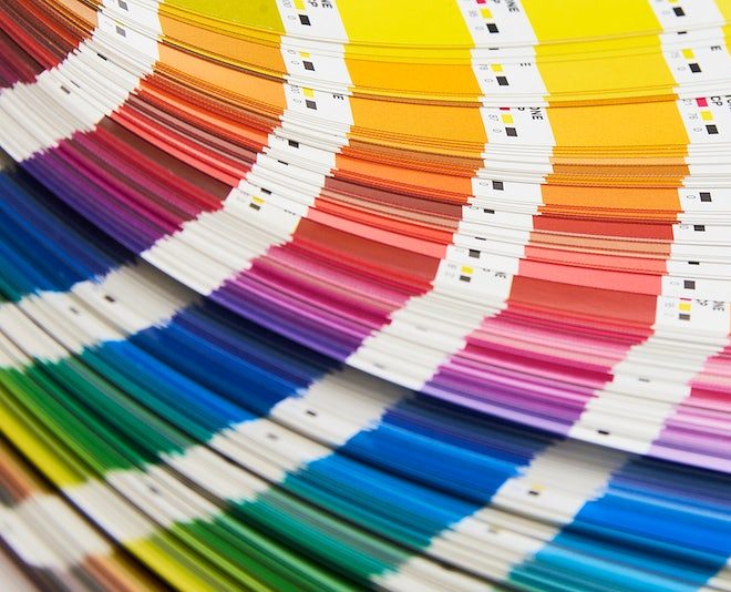
Color Swatches Book
January 20, 2023
Recently Viva Magenta 18-750 has been unveiled as Pantone Color Institute’s 2023 Color of the Year. After a year of a more subdued and neutral Very Peri, this bright shade of red brings a welcome pop of boldness and vivacity to the new year.
Since 2000, the popular paint company has chosen a unique color to represent each coming year. The process of choosing a color, from the name to the shade, takes much careful thought, time, and energy. Pantone team members study world trends and events, and consider psychology when selecting (and sometimes even creating) colors to best represent these factors.
According to an interview with Pantone’s Vice President Laurie Pressman, the Color of the Year “really reflects what’s taking place in the global culture at that moment in time” and that “the popularity of a color is symbolic of the age we live in.”
This year’s Color of the Year was described as “an unconventional shade for an unconventional time”. Viva Magenta was selected to represent strength, optimism, and warmth without being aggressive. The dynamic hue also has an effect on our psychology as well, evoking feelings of confidence and fun. This is a much needed assurance after the rocky past few years, and the bright color can hopefully provide motivation to take on these challenges.
Freshman Andrew Jung described Viva Magenta as “really bright and vivid” and that it’s “strong, bold, [courageous] and gives a sense of strength.”
“It’s a color that really vibrates with vim and vigor, that demonstrates a new signal of strength, which is something we all need for a more optimistic future,” said Pantone executive director Leatrice Eiseman, in an interview with TIME.
Lately, many nature-related trends have boomed in popularity, from home decor involving plants to renewed enjoyment in travel. As a result, the “Magentaverse” is rife with references to the natural world. Being a shade of magenta, it is derived from the bright red carmine dye of the cochineal beetle, a nod to the color’s organic roots. The hue also acknowledges the balance between an increasingly digital world and the environment, as a hybrid of warm and cool colors.
Viva Magenta is “dark but bright at the same time because it’s a shade of pink and red,” according to freshman Melinda Yu.
Pantone’s Color of the Year also has impacts on global design and marketing trends. Many brands collaborate with Pantone to create products in the Color of the Year, and it gets a surprisingly large amount of media attention. This year, Pantone worked with hundreds of brands, including Motorola, Cariuma, and Spoonflower to produce Viva Magenta phone cases, shoes, and patterns. This is only scratching the surface, with the Color of the Year being featured in art galleries and setting trends for the new year.
“All colors represent [to me] emotional type of motion,” said freshman Jasmine Guzman, adding that she feels like “the year ahead will lead to changes [and] growth…and we will learn from our mistakes.”
As Pantone’s 2023 Color of the Year, Viva Magenta not only represents trends from across the globe, but creates them as well. Hopefully, its message of strength and bravery will continue to be reflected in the next 12 months.
Photo Courtesy of RAWPIXEL.COM