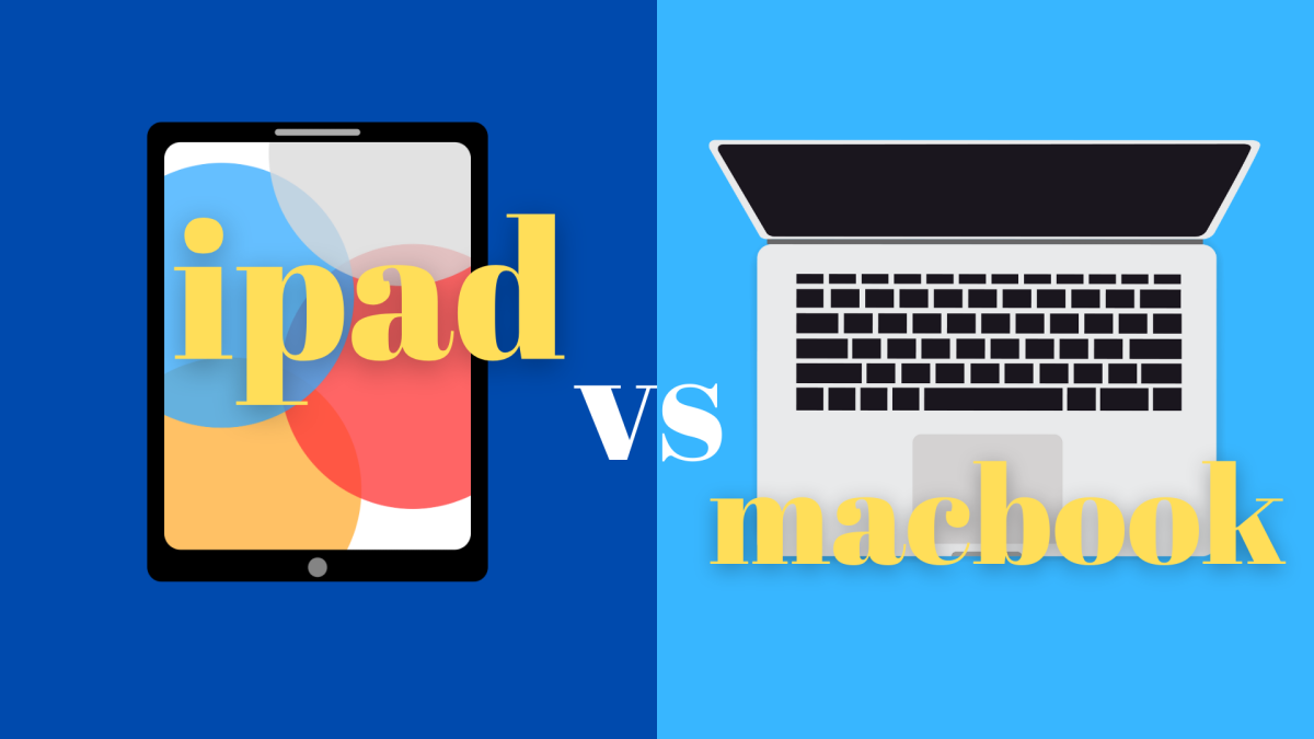
Since 2018, Apple iPads has gained traction for their role in note-taking. This is because of Apple’s creation of the Apple Pencil, which allows students to use their iPads as notebooks through apps like Notability and GoodNotes. In addition to this, many companies like Paperlike have made screen protectors specific to iPad use because they create more texture between the iPad and Pencil, creating a more natural paper-pencil feel. However, for those who don’t use the iPad for its writing and or drawing capabilities, Apple has also created the Magic Keyboard, which further allows for the iPad to be used as a computer. In theory, this may have been a very helpful task. However, in actuality, this may have backfired on Apple as many apps and websites are either not compatible with iPad or the user interface is very aesthetically pleasing.
Take Google Docs (or Docs on the iPad) for instance; on the computer, it is programed so that the comments are beautifully placed on the right side of the page next to where the text is; the iPad however has the document formatted to where the edits are highlighted, but there is just a huge chunk of white where the rest of the document should be.
While the iPad and Magic Keyboard combination may be lighter than the traditional MacBook, this inadequate design with the app interface will become more of a hindrance than a convenience overtime because of this thoughtless design plan. In addition to this, if you are the creative type, you will be unable to access a lot of the Adobe apps; for example, the most used ones include Photoshop and Illustrator. While the iPad does kind of offer these, it is extremely hard to navigate, has a greater learning curve, and is very limiting.
Compared to a MacBook, the layout does not make much sense, and there are a lot fewer things that can be done with an iPad. For example, it is very common for a graphic designer to use both Adobe Illustrator and Photoshop to create their designs(for example, album covers and concert posters). In order to do this, the designer would have to save the various Photoshop files into their computer and then place them onto their Illustrator file. However, on the iPad, this appears to be a much harder task as there doesn’t appear to be any way for a designer to place their files from other apps onto Illustrator or onto Photoshop. Therefore, this could result in a very unprofessional and sloppy design.
However, the greatest debate can come when it comes to note-taking—logically, an iPad may be a better choice. However, this is not necessarily the case as there are some ways that handwritten notes can actually be achieved by using a laptop. For example, a cheap drawing tablet can be purchased off of a site like Amazon and used with apps like Notability or Goodnotes (which is compatible with MacBooks). Additionally, when it comes to art, it is possible for an artist to use Photoshop which also allows users to create beautiful artwork and also allows them the ability to edit the photos that they take.
In the midst of the debate between MacBook vs. iPads, MacBooks are evidently better simply because of how much more versatile they are compared to iPads and how more apps and websites are designed specifically for MacBooks. Furthermore, when considering the purchase of an iPad or MacBook, it is no question that MacBooks should be your first choice.
Graphic Courtesy of ELLIE GLADSON-PANG


